

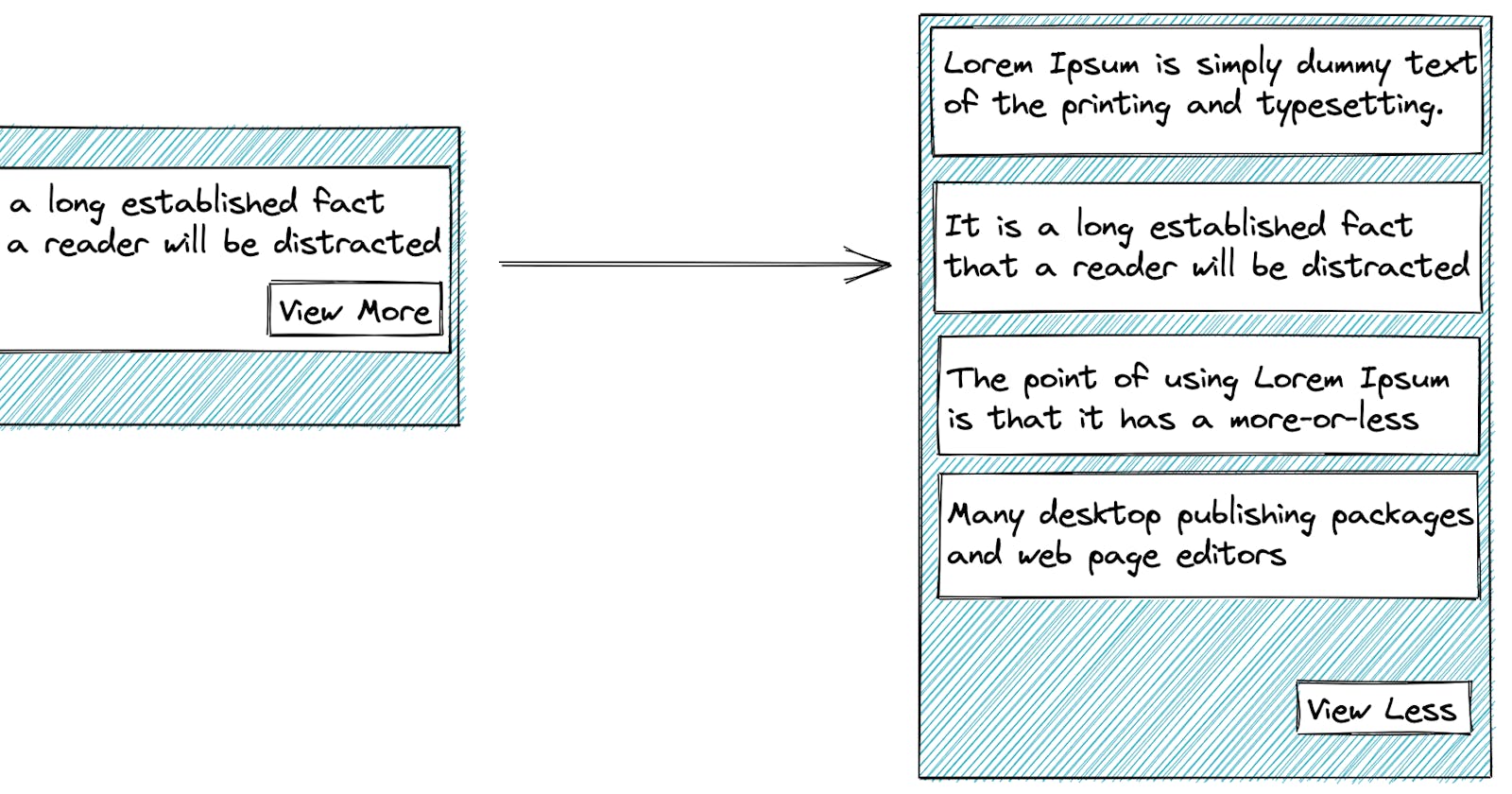
At a high level, we can think of several ways of CSS animation we can attempt. In this blog, we will speak about Preview & View More kinds of layout where the Preview & View More components are different.
The only prerequisite is that the approximate heights of the Expanded content & Collapsed content is known beforehand as we will be animating on the max-height property.
Now if we are to replace the Expanded content with Collapsed content during the collapse phase, happens abruptly with a jank. To resolve this, we should adopt the following animation strategy:
During expand phase
Replace the
Collapsed contentwithExpanded contentAnimate height to accommodate Expanded content
During collapse phase
Animate height to
Collapsed contentheight. This is because theExpanded contentis taller than theCollapsed contentand can accommodate the height transition without abruptly shrinkingReplace the
Expanded contentwithCollapsed contentonce the animation is over
To achieve this, we will be using CSSTransition module of the react-transition-group
Let's say we have the following Collapsed content component
const CollapsedContent = (props) => {
  return (
    <div className="collapsed">
      <p>Lorem ipsum dolor sit amet consectetur adipisicing elit.</p>
      <p>
        Asperiores iste magnam dolores eius ab laboriosam excepturi, consectetur
        consequuntur maiores at voluptas ipsam cum reiciendis assumenda tenetur
        natus in omnis deleniti.
      </p>
    </div>
  );
};
And the following Expanded content component
const ExpandedContent = (props) => {
  return (
    <div className="expanded">
      <p>
        It is a long established fact that a reader will be distracted by the
        readable content of a page when looking at its layout. The point of
        using Lorem Ipsum is that it has a more-or-less normal distribution of
        letters, as opposed to using 'Content here, content here', making it
        look like readable English.
      </p>
      <p>
        There are many variations of passages of Lorem Ipsum available, but the
        majority have suffered alteration in some form, by injected humour, or
        randomised words which don't look even slightly believable.
      </p>
      <p>
        Lorem ipsum dolor sit amet consectetur adipisicing elit. Asperiores iste
        magnam dolores eius ab laboriosam excepturi, consectetur consequuntur
        maiores at voluptas ipsam cum reiciendis assumenda tenetur natus in
        omnis deleniti.
      </p>
    </div>
  );
};
In the main or orchestrating component, we need to add 2 booleans:
isCollapsed (to track which component to render)
isAnimating (to track when to run animation)
So when the animation is starting, we will toggle isCollapsed to false and when the animation has finished, we will toggle isCollapsed to true.
This way we will be able to animate based on the strategy mentioned above.
Main component
export const Main = () => {
  const [isCollapsed, setIsCollapsed] = useState(true);
  const [isAnimating, setIsAnimating] = useState(false);

  return (
    <div>
      <div className="card">
        <CSSTransition
          in={isAnimating}
          timeout={200}
          classNames="content-switching"
          onEntering={() => {
            setIsCollapsed(false);
          }}
          onExited={() => {
            setIsCollapsed(true);
          }}
        >
          <div className="base">
            {isCollapsed && <CollapsedContent />}
            {!isCollapsed && <ExpandedContent />}
          </div>
        </CSSTransition>
      </div>
      <button
        onClick={() => setIsAnimating((prev) => !prev)}
        style={{ display: "block" }}
      >
        {isCollapsed ? "Show" : "Hide"}
      </button>
    </div>
  );
};
As we see here, the user clicking on the Show or Hide button only toggles the isAnimating flag.
The CSSTransition component then handles toggling the isCollapsed flag based on its life cycle methods: onEntering and onExited.
Finished result:
Full source code is available here: github.com/rohanBagchi/react-height-animation-tryout
Thank you for reading this far.